
As remote workforces gain popularity across all industries, remote workers and businesses still find it difficult to collaborate as efficiently as teams working in brick-and-mortar workspaces. Boomerang seeks to bridge the geographic gap between remote teams and individuals and give them the collaborative tools to create their best work. As lead designer on the project, I designed the brand’s core identity and carved out a space in the cloud storage and organization market.
• Project Lead - Individual Project
• Product Research
• UX/UI & Visual Design
User Surveys, Personas, Competitive Analysis, User Stories & Flows, Prototypes, Wireframes, User Testing, & Visual Design.
Adobe XD, Adobe Photoshop, & Adobe Illustrator
Approximately 5 weeks
Create a cloud storage and organization app like Google Drive, Dropbox, Evernote, etc.
• Client requested for me to create the name and the branding.
• Client was unsure if this should just be a desktop or mobile app.
1. Saving Content (links, images, videos, etc.)
2. Organizing Content (categories, tags, groups, and/or folders)
3. Creating Content (notes, documents, and spreadsheets)
4. Uploading Files (videos, images, PDFs, etc.) from computer or mobile device
5. Sharing items, folders with others and vice-versa
6. Collaboration with other users real-time in notes or
documents.
Key points of differentiation with this app is collaboration. By leveraging the “network effect”, it should generate growth
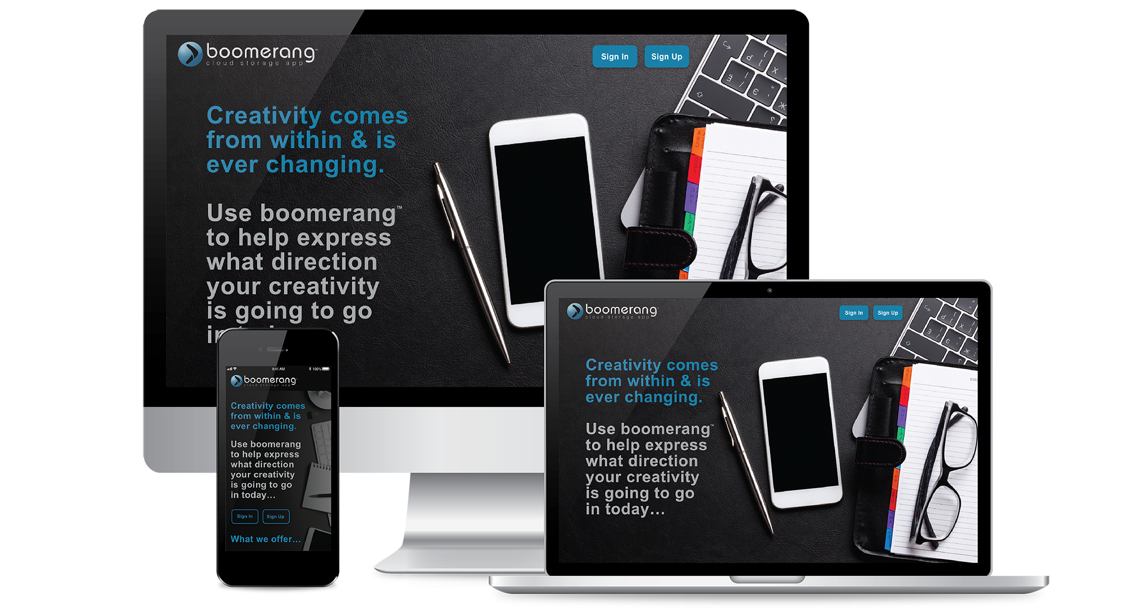
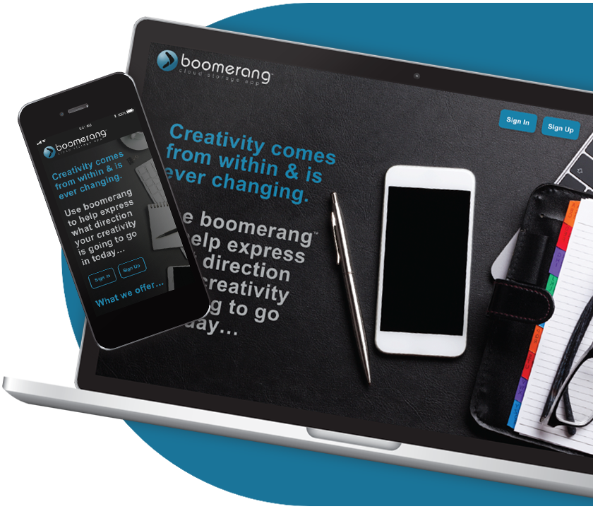
Creation of the Boomerang Cloud Storage App! It has all the functionalities that were requested plus more!
1. The 6 points just mentioned.
2. Highly Customization: The ability to store or share folders with whomever you want.Examples: jobs, projects, music, pictures, albums, videos etc. If it can be saved on a computer, you can save it on the cloud.
3. Real-TimeCollaboration & Sharing: A place to share and collaborate over projects almost immediately stored on the cloud with friends, coworkers even clients. This can help with your workflow or just networking with friends.
4. Accessibility: Be able to save or download files from desktop & mobile devices anywhere.
5. Scalability with price plans to fit anyone’s needs, that can be changed with a touch of your finger.
6. Disaster Recovery & Storage Immortality / backup drives.
Using the competitor’s apps, I conducted a competitive analysis to define Boomerang’s niche in the market by comparing Google Drive, Dropbox, and Evernote. Based on my research, the best way that Boomerang could enter the market was through a combination of strategies that would help to gain users and ultimately retain the users by giving incentives for sharing the app with others. One strategy was to require users to sign up for the app which has free and paid options available. In order for the user to collaborate and share files, it would require the other individual to sign up for the app which is a strategy to ultimately keep gaining new users. Another way of gaining new users and building retention was to give storage space as incentives for referrals. The app itself should focus on ease of use with low barriers for entry (ie. it gets out of the user’s way and straight to business) and has great integration with major third-party apps to fit easily into the user’s existing workflow.

Surveys were conducted to better understand what users were truly looking for in a cloud storage app. Most of the survey participants were young otherwise tech-savvy workers and students. They used cloud storage apps for their everyday work, school, and personal hobbies such as storing music and media. They were often collaborating with coworkers and friends online every day and needed a better way to utilize their files to work more efficiently.
Are you creating content such as notes, documents & spreadsheets?


Do you connect with other users for real-time collaboration regarding notes or other documents?
Are you willing to pay for options above the free plan that offer storage upgrades, speed and other additional features?
When you save something on the cloud do you want it to stay there until you remove it or remove itself after a time you have pre-designated?


From the data collected, I created two User Personas to bring focus on to the target audiences. This allowed me to pinpoint specific frustrations and problems as well as tasks and goals for Boomerang to accomplish. The personas helped to humanize the designs and kept the users at the fore front of each solution built. The first young user tends to use apps similar to the Boomerang app for collaboration as well as a creative outlet and to help keep up with the technologies needed in today’s education system. The next user who is a business professional and a bit older used similar apps as a tool in his day-to-day work to help with productivity, collaboration, and keeping track of projects.


This is where I started to hone in on the functionality of Boomerang. The User Stories allowed the opportunity to prioritize the core functions of the app, so that the interface had the proper hierarchy and information architecture when I started building wireframes. Below are examples of higher priority user tasks that defined Boomerang’s main functionality, along with lower priority tasks that rounded out the user experience. By fully flushing out the high-priority tasks and maximizing their efficacy was key to staying on track.
• Choose the duration the server will keep their uploaded material such as links, images, videos, notes, documents & spreadsheets.
• Share a single item, folders, or group of items with someone else and vice-versa.
• Have more universal support across all desktop and mobile platforms.
• Have the ability to save content found on the web (links, images, videos, etc.) from a computer or mobile device.
• Create and save content such as notes, documents, spread sheets.
• Upload files such as videos, images, PDFs, etc. from a computer or mobile device.

The focus needed to be file organization and collaboration with other individuals, as well as the ability to be able to create, move, upload, download and share, information easily. After defining these user tasks by priority, I now had a hierarchy to structure the screens together to create a seamless, cohesive user experience in the user flows. The two documents were constantly referred to in order to keep focus and narrow the scope.
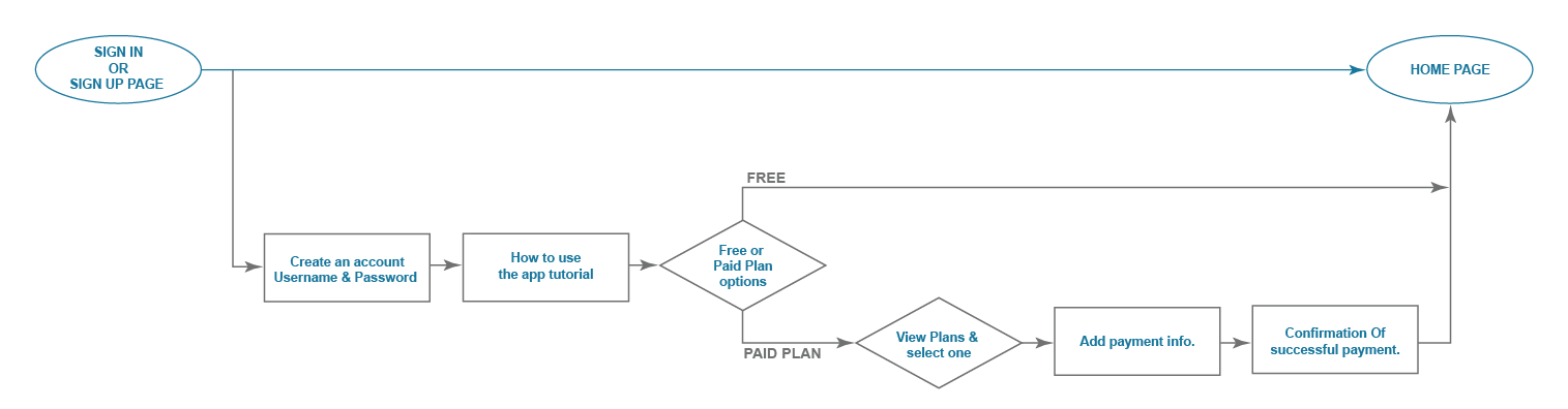
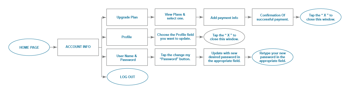

The focus needed to be file organization and collaboration with other individuals, as well as the ability to be able to create, move, upload, download and share, information easily. After defining these user tasks by priority, I now had a hierarchy to structure the screens together to create a seamless, cohesive user experience in the user flows. The two documents were constantly referred to in order to keep focus and narrow the scope.
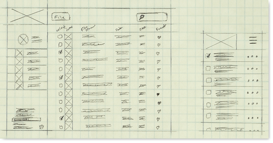

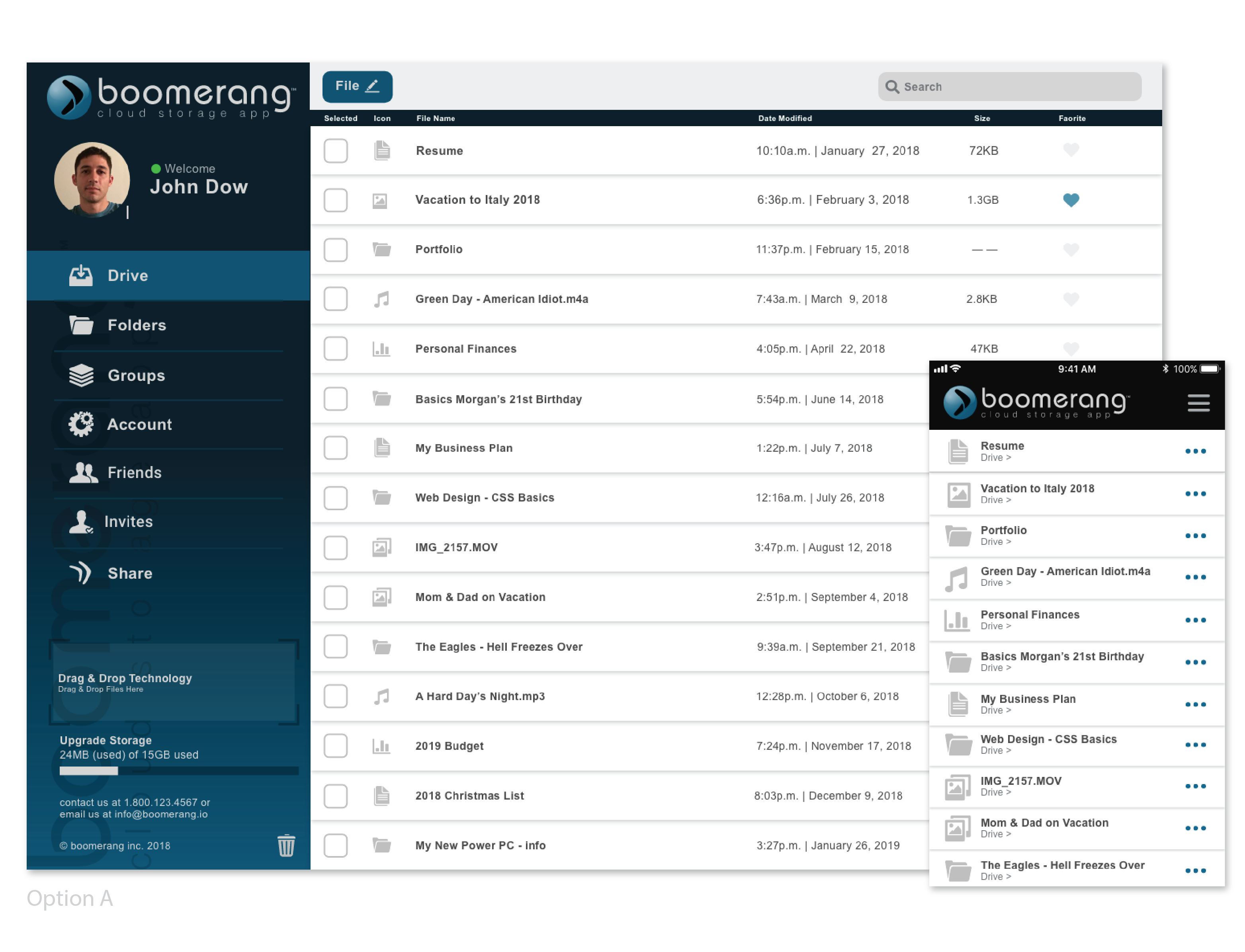
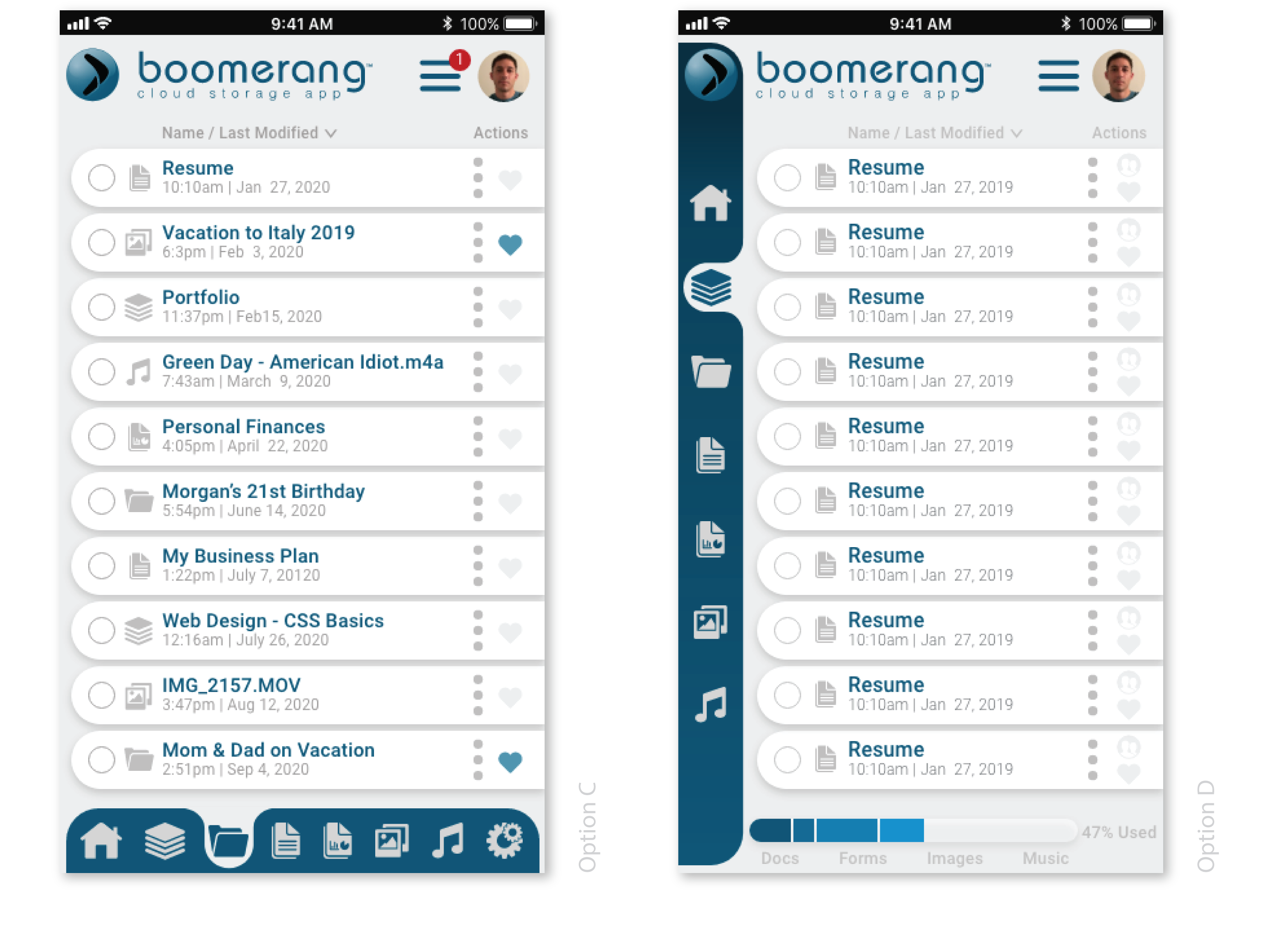
Then using Adobe XD more refined digital wireframes were created from the sketches. Dropbox was a major inspiration for Boomerang’s look and feel, however it needed to look and feel a more professional to the enduser.
Armed with the initial wireframes, usability tests were performed on three different users with four tasks each which were based on the high-priority use stories. They provided invaluable feedback for how to improve the UI’s flow. It was paramount to test my user flows at this low fidelity state because I needed to better understand what was working and what was not working to ensure a smooth user experience throughout the later iterations of the project. It also meant that I could make changes and iterate with user feedback quickly, without marrying myself to any one concept.
For example:
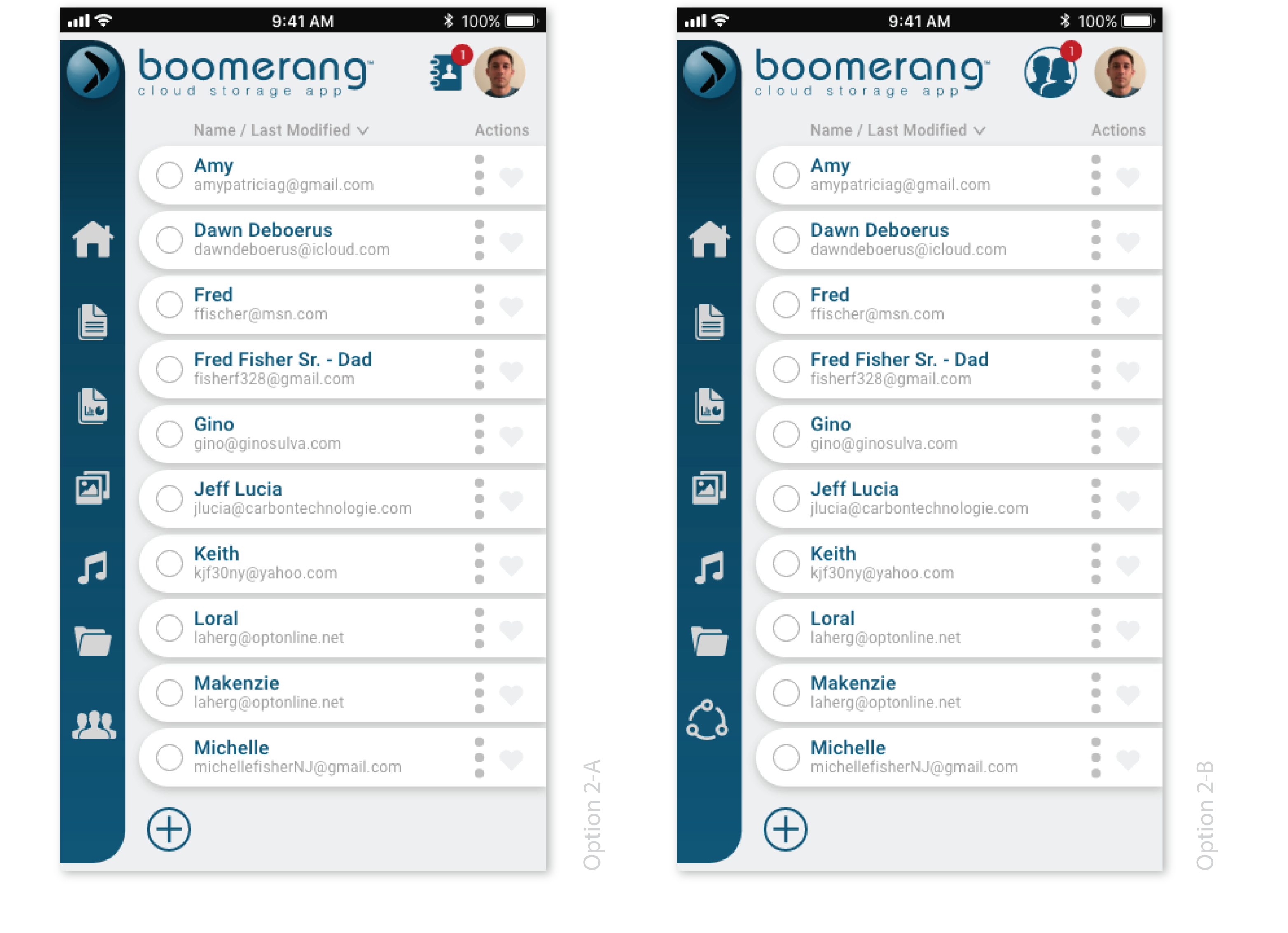
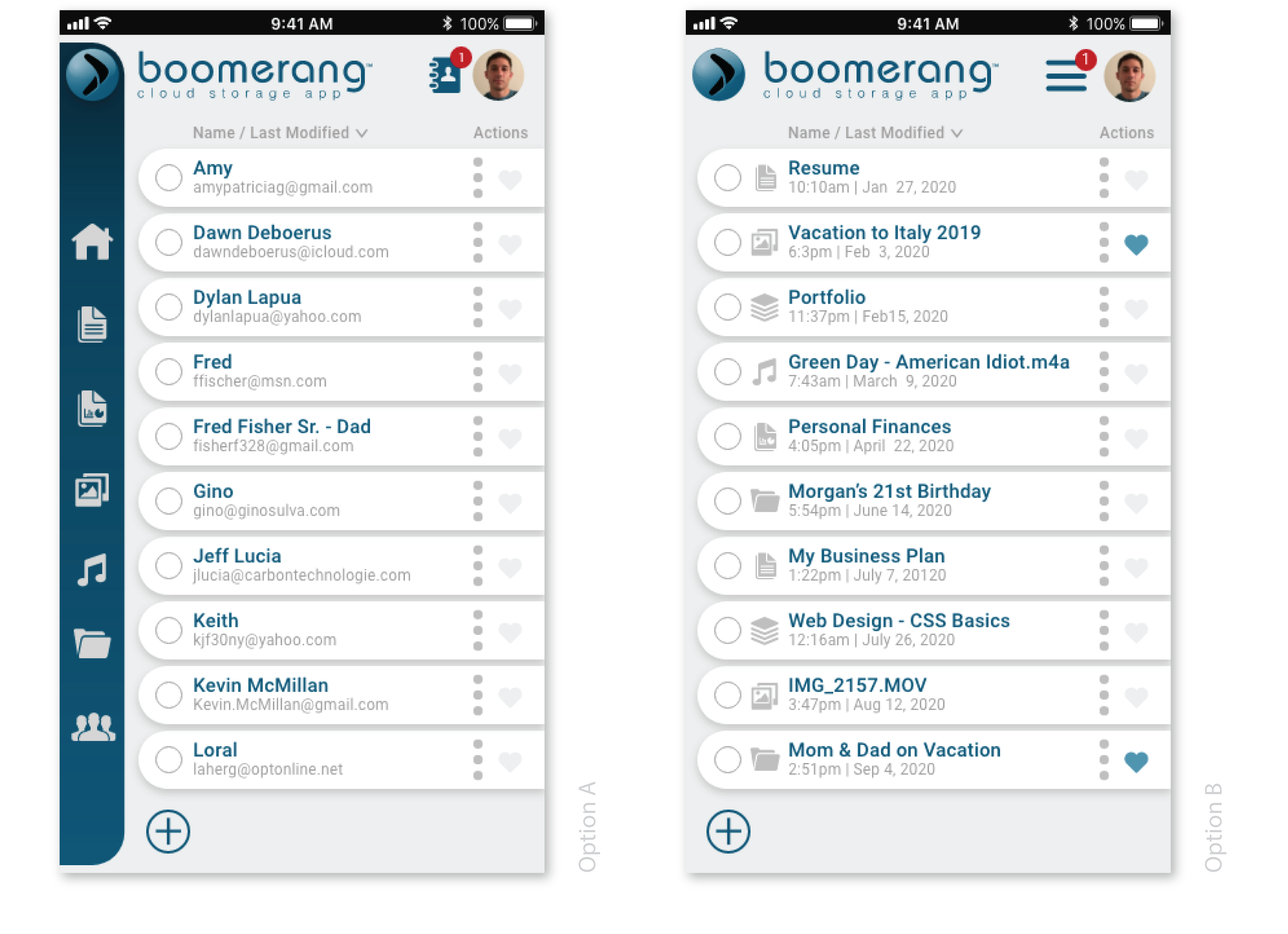
A user struggling to locate the edit button in order to complete the task. The user stated they were used to seeing a plus sign on some popular apps to create documents. After doing some research I realized the user was correct.

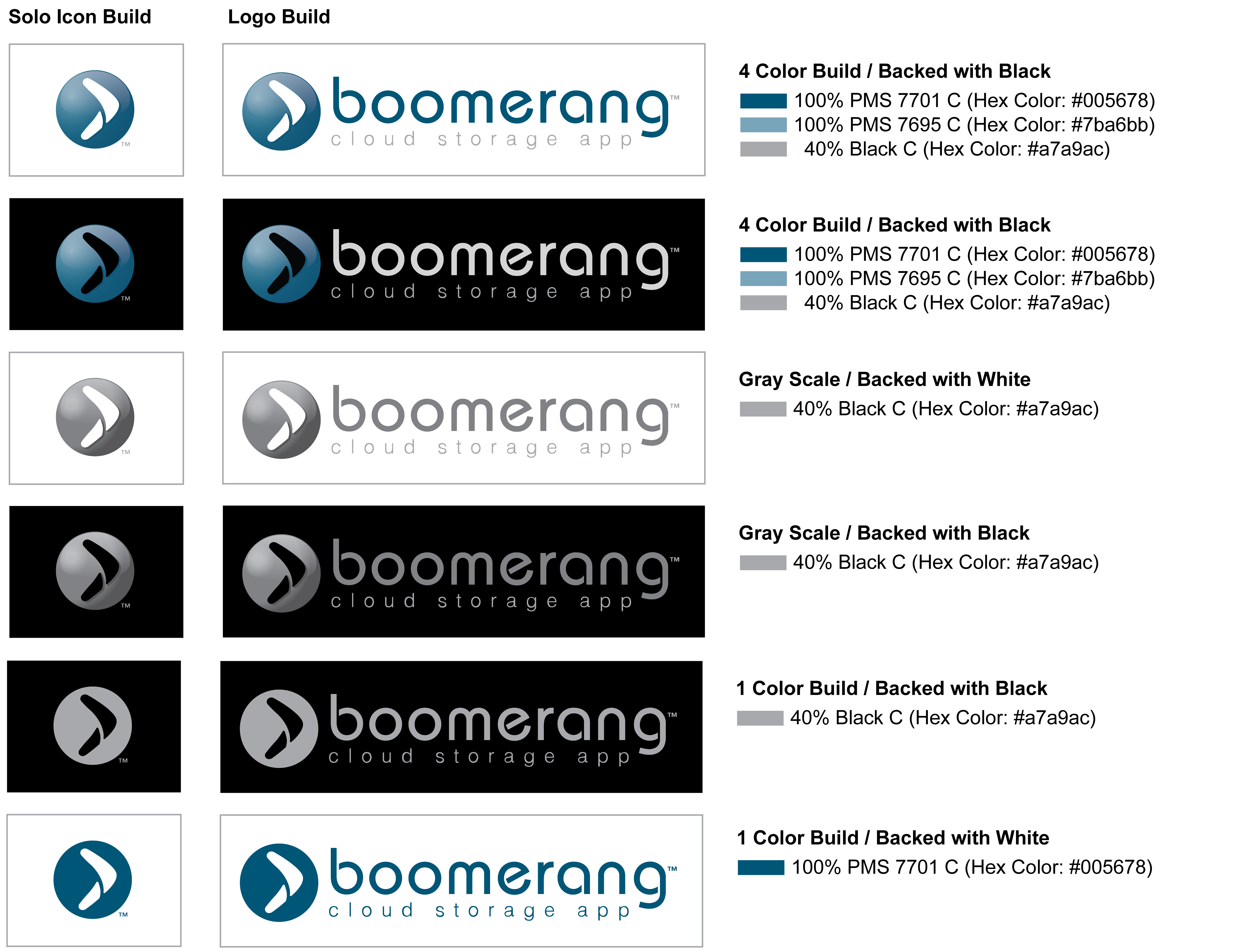
Research was conducted again to analyze the competitor’s brands. This time I focused on the competitors in the cloud storage market and other applications making an impact in the market at the time. I chose the boomerang because it is known for being something that gets thrown and returns to the user, the cloud storage app does a similar function, and therefore the Boomerang name was perfect to choose for the brand; along with being a lighthearted and memorable name. I then created sketches of logo concepts attempting to capture a high-quality looking logo that evoked a confidant, youthful and lighthearted feeling. This was all created while not losing focus on the social collaboration aspect of the app and the specified target consumer “Millennials”. It was now time to create the style guide and mood board to help set the tone and style of the end product.
The style guide was created with the intent of showing how the logo and its variations are allowed to be presented. This is usually due to presentation restraints such as background, print process, colors limitations.
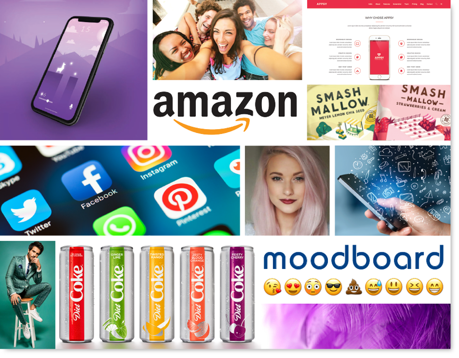
The mood board helps capture the look and feeling that is intended for the Boomerang brand and products. The target audience for this brand and product was “Millennials”, so the board needed to convey what brands, styles, and emotions are attracting the “Millennial” age group in the market at that time. This is completed by compiling imagery, typography, photography, colors, & styles that evoke the appropriate feeling for the target audience. The mood board can also help by making sure all the stakeholders understand the stylistic direction of the app and brand before too much time has been spent in the Ui Kit and Mockup stages.
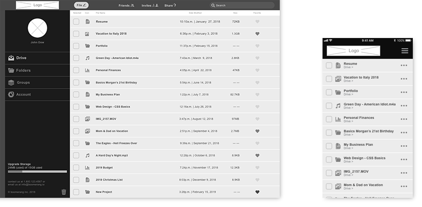
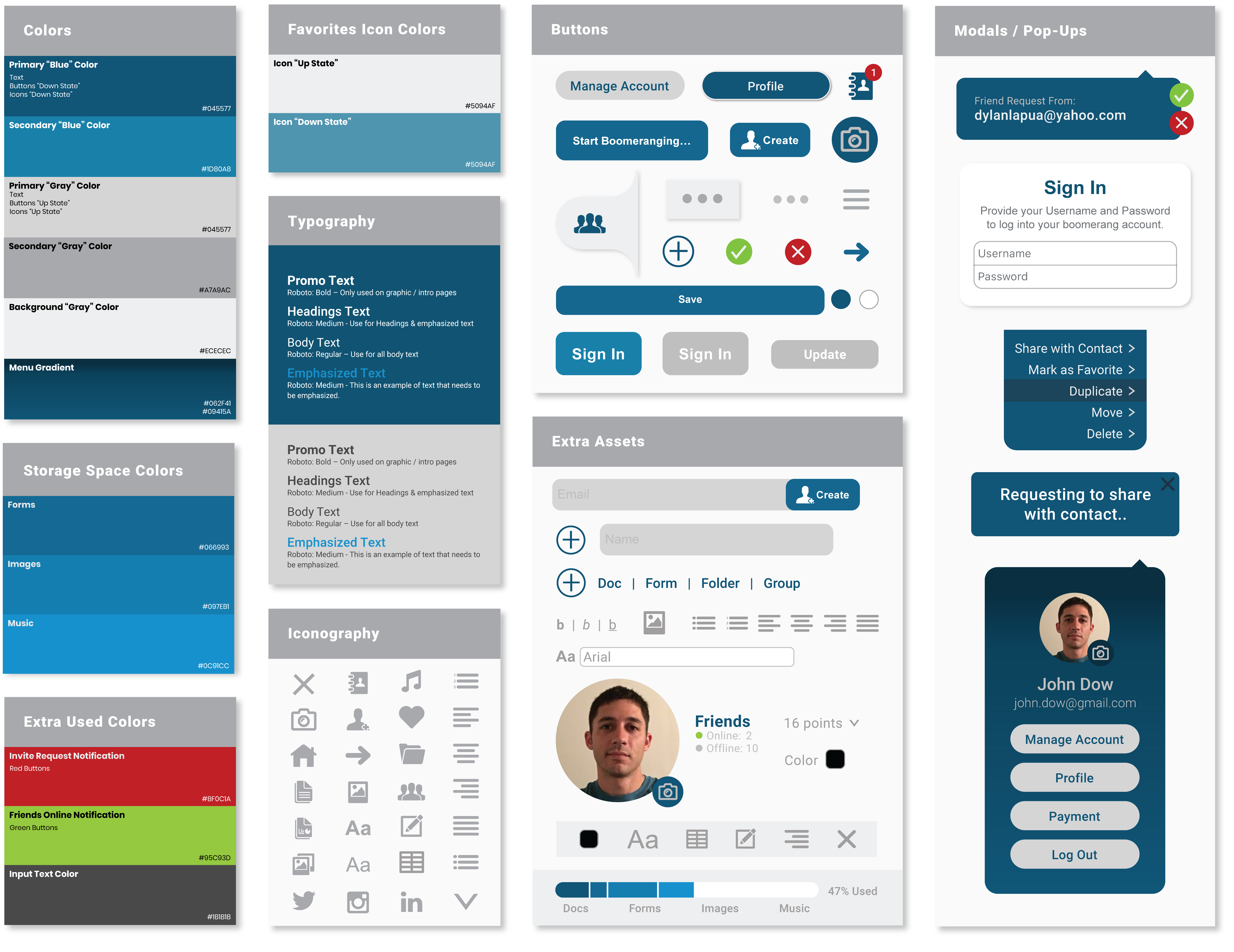
The UI Kit was created to have elements and requirements to hand off to the developer. Hopefully this information will inform the developer of any specifications or restraints that are intended to follow from the design process and/or the clients approval. This can also result in a considerable amount of time saved for the developer due to less questions and rework.
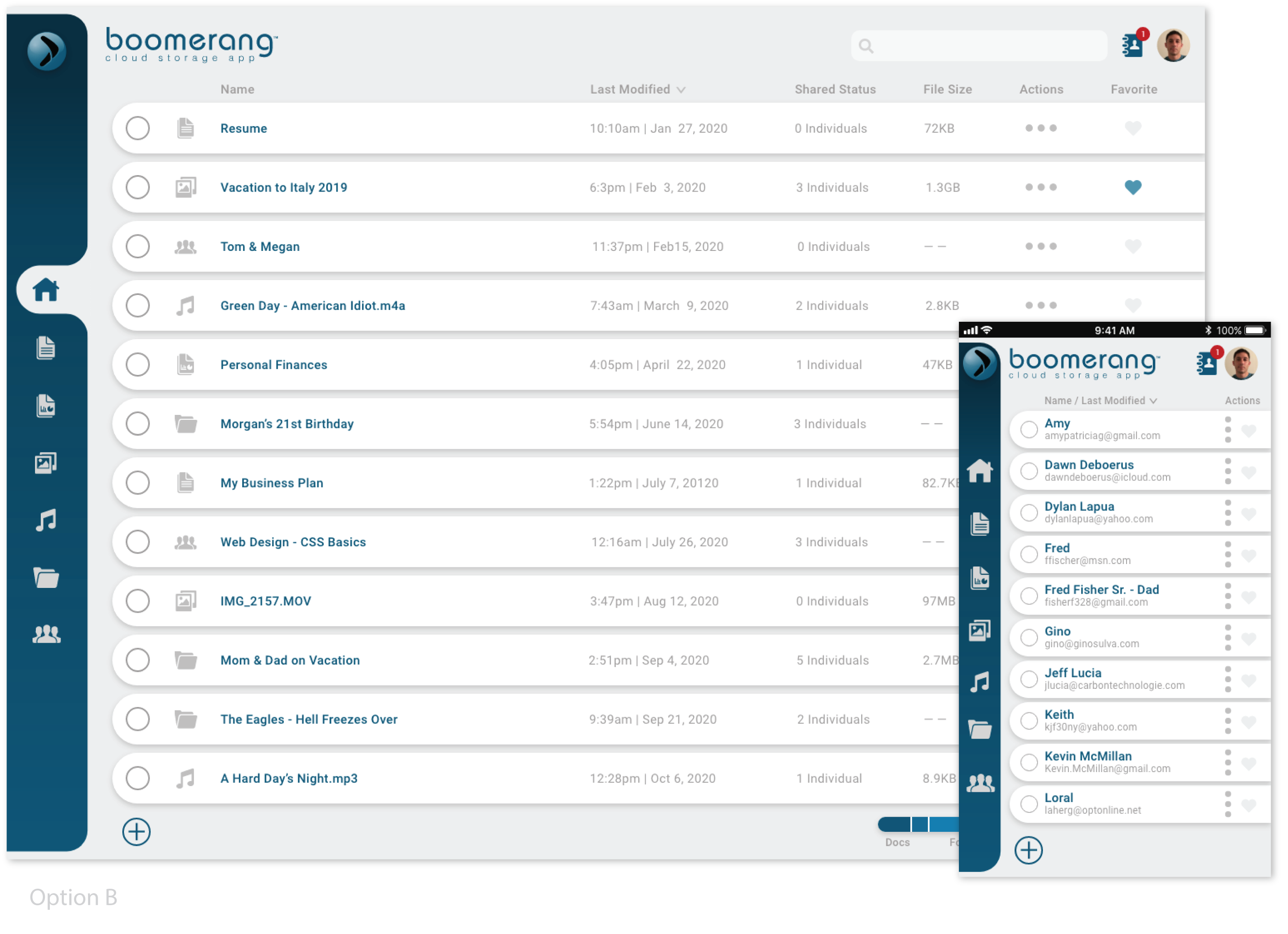
Once the basic structure of the app was finalized, it was time to create a mockup to be tested with all the information from the previous research on real people. In the mockup stage I developed the wireframes digitally by using Adobe XD to create the clickable prototypes. It was here that I began to face some real challenges as the mockups came to life. I needed to revisit several of the previous user flows and tasks to streamline the functionality of the design. This is due to finally interacting with the actual flow of the product and no longer feeling natural or missing transitional steps.
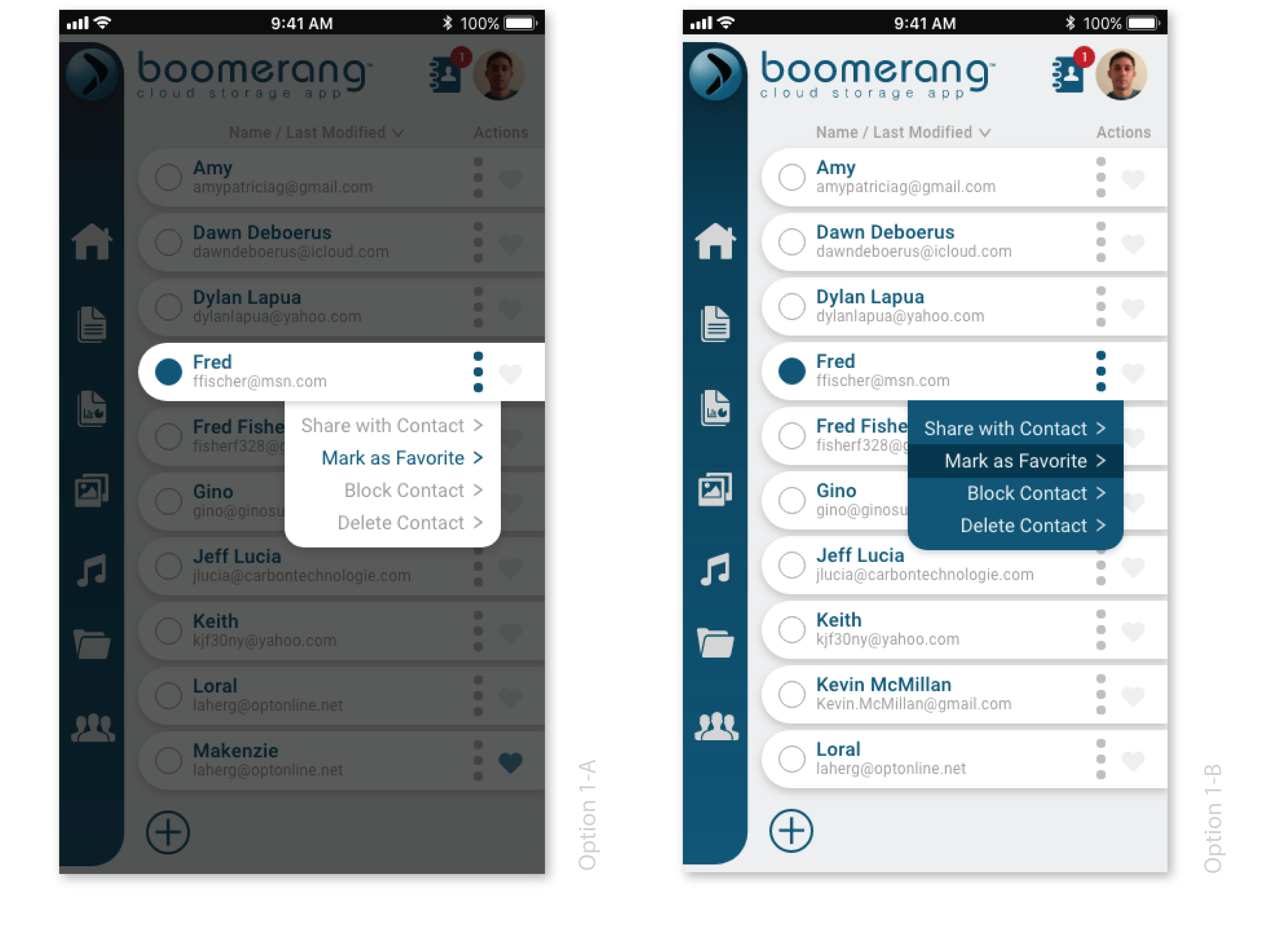
This is the time to seek clarity on certain points that may not be clear on how the end user may be feeling about a process or the appearance of something you have created from the user interface. Three separate preference tests were conducted to receive user feedback on different design elements. The tested design elements were then edited on the mockup to reflect the users’ most popular choices, then another user test was performed on both platforms with the same previous users. Feedback was positive; all users felt like it was a much better experience.
This was the fun step. Creating the final look of the mobile and desktop designs were meticulous work, but finally validating my hypotheses about the visual design choices with actual users was even harder. Not only did I have to study how users used the app, but I had to defend some of my design choices because at times they were questioned and challenged in preference and usability tests. However, each revision I created helped to arrive at better iterations that struck closer to the mark of what Boomerang needed to become and the testers helped target weak spots in the design and usability.
The User Surveys proved to be extremely beneficial for the development of this app. Researching the User Flows of competitors was extremely helpful in guiding the app on what screens and/or modal windows to create. Perhaps the greatest learning curve for me personally was watching a user struggle with are quested task during the usability test that I thought was simple. I empathized with the user and wanted to solve the problem for them. After some research I made a major change to the app’s navigation in which to my surprise all the users who tested the updated app preferred it to the original. I know amore in-depth study of how competitors conduct similar processes can be done, however I feel that the Usability Testing was a great way to determine what did and did not work for the Boomerang Cloud Storage App.