CarbonProvision allows a company’s IT team to seamlessly add custom apps into the Apple's Setup Assistant process. This remote app also allows IT to not have to be present when a new computer is being set up by the end user.
1. The tool should walk the user through provisioning their system without IT help.
2. The interface should be instantly familiar to the user.
3. It must handle passing the secure token from the GUI created User account to the programmatically created Admin account without burdening the user with the process.
• Project Lead - Individual Project
• Product Research
• UX/UI & Visual Design
User Surveys, Personas, Competitive Analysis, User Stories & Flows, Prototypes, Wireframes, User Testing, & Visual Design.
Adobe XD, Adobe Photoshop, & Adobe Illustrator
Approximately 3 weeks
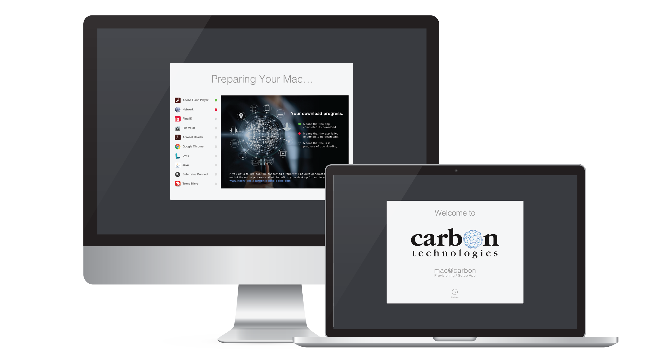
The app needed to be a seamless, transitioning from Apple's Setup Assistant into the app. The major focus was to keep a similar interface as the Setup Assistant, so the user felt that this was a continuation of what they just finished. On top of that, there was a need to communicate that this is customer specific configuration. Since the app was running in Kiosk mode, we had to make do with very limited components of the OS UI. Finally, after the app ran, it still had tasks to complete (i.e. FileVault encryption and end-user notification of failures and tech support options). Some of these tasks were out of our control (i.e. FileVault encryption), but needed to occur before we could perform our last tasks (i.e. end-user notification of failures and tech support options)
CarbonProvision is a Mac OS X application written in a combination of languages (Swift, LiveCode, Bash and Python). The user and competitive research showed a strong desire to stay with the look-and-feel of Apple's SetupAssistant and to keep the process simple, because this would be the first time the user is touching their new system. CarbonProvision benefited by clear definition of the expected user communities (Admin and End-user). By focusing on these, we could make sure that IT's requirements were met and then verify and modify the workflow to meet the needs of the end-users. While it took additional Usability Testing rounds, the information gathered from the two different groups was very different. While Admin testing largely showed strength and deficiencies in the UX, most End-user testing seemed to focus on UI.
A SWOT Analysis was performed primarily to determine the strengths of each competitive product. CarbonProvision is not a competitor, but instead an in-house product to create a best-of-breed provisioning process for the Mac community. We looked at DEPNotify, Mac@IBM and SplashBuddy as the three most popular products. This was determined by internet searches and the question being asked at a meeting in NYC of Mac Admins. This analysis provided great insight and also helped focus the product on mimicking Apple's Setup Assistant to maintain continuity. Another gem from the NYC Mac Admins meeting was that they were asked about the other poorly received products in this space that broke the paradigm of the Setup Assistant UI. Those products were lambasted by these admins, especially when asked if those products generated more help desk tickets, to which the answer "Yes" was unanimous.


I performed a User Survey with 15 respondents that were experienced Mac Admins or Mac Users. The input from these users directed every feature and behavior of the workflow minus one, which was overridden by a HIPPA requirement. Based upon how well the product was received by the general community and the specific areas of praise, it is clear that the information gathered from the User Survey is directly attributable to the success of the product. The final product was so well received in this community that a project to replicate this on the Windows platform was immediately launched.

The Apple Setup Assistant performs a power check before allowing the user to start the process. Should we implement a similar power check before allowing an end-user to go through provisioning?


Are you an IT Admin or are you an End-User?


7. Based upon question 6, Do you think the extra development to add this functionality would be worth adding to this project?

I created User Personas of two individuals that represented two different user communities.
This group represents the part of the community focused on why this product is being created in the first place. While IT configuration and desk-side delivery were the current method, the customer wanted to empower the user to perform this task themselves. IT wanted to make sure that all of their requirements were met. If they couldn't be met, then the efficiency of End-user provisioning would be greatly diminished.
This group represents the mass user base of the product. These End-users will generally only interact with the tool whenever they receive a new Mac (at hire time and approximately every three years for a refresh) but will be directly responsible to perform the configuration. If the app did not allow an End-user to use it without external instruction, then the efficiency of End-user provisioning would be worthless.


Based off the User Survey and more in-depth User Personas, I created User Stories to determine the types of tasks to include in the product. Using percentages and statistics from user research, as well as specific comments made by potential users, I compiled lists for new and returning users comprised of 15 tasks.
• Be able to learn what about the company’s services before I speak to a representative.
• Be able to get a quote or request info for my project with ease.
• To be able to see the work they have printed previously.

Focusing the User Flows based upon the two User Personas was beneficial to ensure that the primary needs of both user communities were being served. In the case of IT, the impact of not performing all of their tasks would be that the process would have less value. In the End-user case, if a large number of End-users were unable to go through the process them selves without external help, then the entire project would be cancelled as the product would be worthless.

First, I designed Wireframes with pen and paper. This would create quick options for the apps logical, visual consistency and navigation to ensure the app stays simple and clear for the end user without taking all the time on the computer.

Then I create the Wireframes in a digital form using Adobe XD. For inspiration I referenced competitive provisioning products DEPNotify, Mac@IBM and SplashBuddy as the three most popular products.


I used Adobe XD to create this prototype using the digital wireframes created previously. The Adobe XD Prototype was used to perform the Usability Test with three different users. The users were given three tasks in which they provided invaluable feedback for how to improve clarity and user-friendliness for the product. All three of the respondents had no real issues as I ran the User Testing process. I believe this is due to the applications simple and user friendliness, unlike the competitors we were using for reference, as well as all the feedback gathered through the research process.

I was attempting to capture a high-quality looking logo that has a modern yet confident look and feel. I also wanted to make sure I was creating a logo with personality all of its own, not “generic” looking like the direct competitor’s logos “DEPNotify, Mac@IBM and SplashBuddy”.
The style guide was created with the intent of showing how the logo and its variations are allowed to be presented. This is usually due to presentation restraints such as background, print process, colors limitations.

The UI Kit was created to have elements and requirements to hand off to the developer. Hopefully this information will inform the developer of any specifications or restraints that are intended to follow from the design process and/or the clients approval. This can also result in a considerable amount of time saved for the developer due to less questions and rework.

At this stage by using Adobe XD I am finally able to see how all the pieces come together. I started by applying style guide requirements and at the same time looking at each page as a whole. High quality images were found and other resources that the style guide did not provide helped create the best user interface and experience.

This was the fun step. Creating the final look of the mobile and desktop designs were meticulous work, but finally validating my hypotheses about the visual design choices with actual users was even harder. Not only didI have to study how users used the app, but I had to defend some of my design choices because at times they were questioned and challenged in preference and usability tests. However, each revision I created helped to arrive at better iterations that struck closer to the mark of what Boomerang needed to become and the testers helped target weak spots in the design and usability.
• Provision 2 reduced system setup from a highly variable time window of 20-30 minutes to a very consistent window of 9-10 minutes and reduced errors during provisioning by over 90%.
• As for unsolicited end-user feedback, users reported being more aware of what was occurring as well as knowing precisely where they were in the process.
• For end users that came from other organizations and used Provision, the comments were wildly positive, primarily focused on how much better the Provision experience was vs the organization they came from. We even received a few unsolicited comments from end users who left the company and reached out tosay how vastly better Provision was vs their new organization.
When creating this app, I was committed to utilizing the UX processes. Admittedly there were times when I felt that this process was taking me down the wrong path and taking longer than expected. Ultimately after analyzing all the data collected, the modifications as well as discussions with respondents and the developer, I was surprised to see how well the design and its workflow had resonated with anyone that tried the app. Some steps were difficult to execute, and I needed assistance with developing some questions (especially for the Admin Group) due to not knowing the technical terminology needed to communicate. The entire working group was very pleased with the push towards a data driven design. I feel more confident in both the process and my abilities thanks to doing this project.